As I mentioned in an earlier post, I am self-publishing and selling my memoir, Black Fish: Memoir of a Bad Luck Girl, on Lulu this spring. Yes, it’s true, I posted Black Fish in its entirety last year, but I expanded a lot of it so there’s even more drama to read, if drama is your thing (and I know it is). Plus maybe I’ll make a few (very few, I imagine) bucks off it.
I’m finally done with revisions, and now’s the fun part: cover design! And my friend Eva, a talented letterpress card guru, is in charge.
The only problem is she drafted so many covers I like, I’m having a hard time deciding. That’s where you all come in (all half a dozen of you): in the comments, point out your favorite cover(s), and from these, I’ll randomly pick one person to win a free copy of my book as well this box set of Eva’s adorable French bulldog cards.

Who doesn’t love Frenchies?
And now finally, drumroll please, here are the covers.


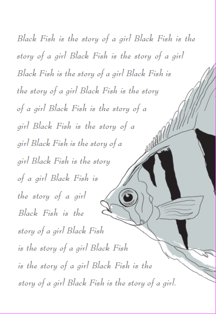
Of course we can mix and match the images and fonts.
Now go comment! You have till next Friday, April 8.
My favorite is definitely number 5… the fish fins look ghostly and it makes you curious about what is on the back.
Hi, I’ve been following your blog for sometime since I read your article on CNN last year. Congratulations on finally getting your book to press! I vote for the 5th cover as well. It’s interesting, simple, and elegant. The back is what clenches it. Continuity to the synopsis.
I like Cover 5 the best — I like half of the fish showing, but not so much when it’s the front end as in Cover 3. I just feel like Cover 5 is more intriguing.
I like cover 3 the best. Can’t wait to read this, Angela. :-D
I like #5. I love the way it wraps around and seing it swimming out of the frame on the front makes you curious to see more. It also reflects the title in an interesting way.
having read the book–i love being able to say that, btw–i like #5 the best, too, but i wouldn’t have everything muted out; i like it stronger, like it is in #s 3 and 4.
if you’re leaning towards the fish’s head, i like #1 best, but again would have the colouring of #s 3 and 4 (read: white background w/ black fish/copy.
did i win?!? j/k.
when do we get to vote on the author photo?!?
#4 or maybe #5. They both have “best seller” written all of them.
#1 hands down. (I do like the back of #5 but you said you could mix and match.) #4 and #5 seem too sweet; with #2 everything seems too blah. #3 the fish pops too much so I can’t focus on the title. #1 is classy and mysterious and intriguing. That’s the one that makes me want to read the book the most. Congratulations! can’t wait to read!
On #5, I like seeing the tail-end first, it makes me think that I would like to find out where this fish is going…
I have to say though it was a tough call between 5 and #1. The Big fish eye is most expressive and almost seems lost on this cover….like she’s looking for her water. I like that idea but I did not like the lower case font. I think blending the fonts from #5 with #1 would be ideal.
I like 3, but maybe with the tail of the fish on the back a la 5. Font wise I like 4 :)
Could I have been more mix n match?
I like the covers that have just the half fish (#1,#3) more than the whole fish. #5 is really awesome, eerie with just the wispy tail showing. I also like the typography (particularly the lower case title) of #3 most.
so clearly cover #4 – no contest actually. There are a lot of #5 partisans here but I posit that is because you also posted the back cover….
Definitely number 5. I like the fact that your name is nice and BIG! Plus, I think the back of the fish is prettier than the mouth and eyes bit.
thanks for voting everyone! now i am even more torn. ;)
And its another vote for #5! Although not having (yet!) read the book, I can only assume there is a connection between the Fish and all the “drama.” Good for you, let me know when its available!
thanks meg!
yes, a very big connection between the black fish and the drama. the first xmas gift i gave my ex was a black angelfish, which, unbeknownst to me, his mother considered very bad luck, thereafter, blaming her family’s misfortunes on me.
I like #5 the best :)
#3 for me!
Cover #3: Good Enough For Me!
I would choose #5, but pump up the contrast. It will look better on Amazon and other internet sites. #5 has the feeling of leaving…which is probably in your memoir. Best of luck with the book. I’m a big fan of SheWrites!
I’d say start with #5. It has a lot of the main themes present in it, and I can easily picture it sitting out on the main table as you walk in the door to a Walden’s or a Barnes and Noble. If it is successful, or if you attract the attention of some libraries, you could switch to #1 or #4–number 2 (in my humble opinion) looks eerily like a textbook. Back to #5, however, it also fits the idea behind the subtitle “Memoir of a Bad Luck Girl” in that the fish’s full glory has been, by some trick of fate or what-have-you, missed by the ‘Cameraman.’ All-in-all, it sets the proper tone and mood. It catches the eye and the imagination while being able to tell you what a book cover should.
(Or perhaps I’m just over-thinking this.)
Number 5 is by far the best, although I would make the stripes on the fish black like it is on the back cover. I am really excited to read your memoir Angela!
Hi Angela! I love the fifth cover — it looks mysterious and leaves the reader wanting for more. The colors are muted which look nice against the white backdrop as well — I thought the colors were too harsh and dark in covers 1 and 2. Good luck with the book!
[…] of all, thanks to everyone who participated in helping me pick a cover for my memoir, which I’m self-publishing this spring. Twenty people commented, which was far more than I […]
[…] books I ordered have finally arrived! Now I can finally send free copies to the folks who helped me decide on a cover. Remember, if you still haven’t sent me your address, please do so at angelatungwriter AT […]
[…] book news, I was happy to hear that the cover contest participants have begun to receive their free copies. I don’t get the postal system: I think my friend […]
[…] by Planned Parenthood. I kicked off the publicity campaign for my memoir by asking you guys to help me pick a cover and held a contest giving away copy of my […]